
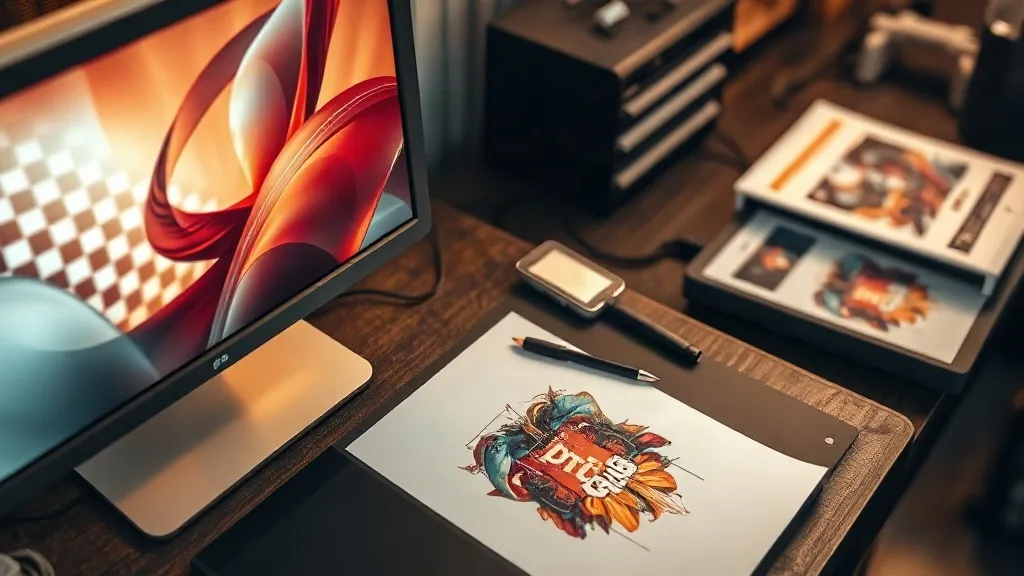
You can own a well-tuned press, fresh film, and a powder routine you have practiced a hundred times, and still pull a transfer that looks muddy or blotchy. When that happens, most operators head straight to the heat press and start changing settings. Nine times out of ten the real problem was sitting in the design file the whole time. DTF transfers are unforgiving about source artwork: whatever detail, color, and edge quality you send to the printer is what you get back on the shirt. This guide walks through the file-side decisions that decide whether a print looks sharp or amateur, and how to build artwork that survives the trip from screen to fabric.
Why the Design File Decides Print Quality
A dtf workflow prints wet ink onto film, dusts it with adhesive powder, cures it, and then presses it onto fabric under heat. Every one of those steps can only preserve what the file gives it. If your artwork is a 72 DPI JPEG pulled off a website, no amount of press tuning will bring back detail that was never there. If your blacks are built from rich CMYK mixes, the printer will lay down far more ink than the film can absorb cleanly. If your edges are soft, the powder will cling to the fade and produce a fuzzy halo around the design.
The practical takeaway is simple: treat file preparation as the first production step, not an afterthought. A clean file makes every later stage more forgiving, from powder shaking to peel temperature.
Resolution and File Format Basics
Start with the numbers that actually matter. For DTF, aim for 300 DPI at the final print size. That means if you are printing a 10-inch wide design, the file should be roughly 3000 pixels across. Scaling a small file up to fit a large print is the single most common cause of pixelated, fuzzy transfers.
Raster Versus Vector
Logos, lettering, and simple shapes belong in vector format. Vectors scale to any size without losing edge definition, and they export cleanly to the RIP software. Photographs, textured illustrations, and gradients are raster by nature, so keep them at full resolution and avoid repeated resaving, which degrades JPEGs over time. When in doubt, keep a layered master file and export a flattened copy only for printing.
Transparency Matters
DTF relies on a white ink layer behind the color, so your file needs a genuine transparent background, not a white rectangle. A white box around a logo will print as a white box around a logo. Check for stray white pixels along the edges of cutout subjects, since those become visible white fringing on dark garments.
Color Mode and Ink Limits
Design in RGB while you work, but understand that the printer converts to CMYK plus white. Highly saturated RGB colors, especially neon greens and deep blues, will shift during conversion. If a client has an exact brand color, ask for the Pantone reference and test a small print before committing to a full run.
Total ink coverage is the other trap. Very dark, heavily layered blacks can exceed what the film and powder can handle, leading to blotchy areas that never fully cure. Build rich blacks deliberately rather than stacking every channel to maximum, and keep large solid areas of dark color in mind when you choose powder grit. A fine powder suits detailed work, but heavy ink loads sometimes need a coarser powder to absorb properly.
Halftones, Gradients, and Fine Detail
Gradients are where DTF files most often fall apart. A smooth fade from color to nothing looks great on screen, but on film it becomes a scatter of tiny dots that powder clings to unevenly. Two habits help. First, avoid fades that taper to near-zero opacity; end them at a small but visible value so the printer lays down a consistent dot pattern. Second, if you need a soft look on dark fabric, consider a halftone pattern with a defined dot size rather than a continuous fade, since halftones hold up far better through powder and press.
Fine lines deserve the same care. Hairline strokes under about 0.5 mm can break up or disappear entirely. Thicken them slightly in the file rather than hoping the printer resolves them. The same goes for small text: keep it above roughly 6 points and avoid thin, light-weight fonts on busy backgrounds.
Edges, Outlines, and the White Layer
Because DTF prints white behind the color, edge quality is visible from both sides. Soft, feathered edges collect powder and produce a halo that becomes obvious after pressing, especially on dark shirts. Clean, hard edges give the powder a defined boundary to sit against. If you want a distressed or vintage look, build the distress into the design intentionally with crisp shapes, not with a blur filter.
For designs that will sit on dark fabric, a thin white or light outline behind dark lettering can improve contrast dramatically. Add it in the file as a deliberate stroke, sized to at least a couple of pixels at print resolution, so it reads as a design choice rather than a printing error.
Building a File Checklist Before You Print
Before a file goes to the RIP, run it through a short, repeatable check. Shops that print consistently usually have this list taped to the wall next to the workstation.
- Resolution confirmed at 300 DPI at final print dimensions.
- Background genuinely transparent, with no stray white pixels at the edges.
- Text converted to outlines so fonts cannot substitute on another machine.
- Hairlines thickened and small text enlarged above the legibility floor.
- Gradients ending at a visible minimum opacity, or converted to halftones.
- Rich blacks checked for excessive total ink coverage.
- A small test print run before a large order, especially for new clients or unusual colors.
Printing a small proof costs a few minutes. Reprinting fifty shirts because a logo had a white halo costs a day and a customer. If you are sourcing transfers rather than printing in house, ask whether the provider accepts your native file and how they handle color matching, since that conversation prevents most surprises. Many shops that order dtf transfers from a supplier learn this the hard way on their first large batch.
Working With Client Artwork
Customers rarely send print-ready files. They send screenshots, social media downloads, and logos saved from a website header. Set expectations early with a short note on your order form explaining what you need: vector files where possible, 300 DPI rasters, transparent backgrounds, and font names if they have them. When a file is unusable, offer to redraw it for a fee rather than printing something you know will look poor. That conversation is uncomfortable once, but it protects your reputation far more than a rushed job ever will.
It also helps to keep a small library of approved test prints for common garment colors. When a client asks how a design will look on a navy hoodie versus a white tee, you can show them instead of guessing. Anyone searching for dtf transfers near me is usually looking for exactly that kind of local, hands-on guidance, so being the shop that answers these questions well is a genuine advantage.
Frequently Asked Questions
What resolution should my DTF design file be?
Aim for 300 DPI at the final print size. A 10-inch wide design should be about 3000 pixels across. Upscaling a low-resolution file to reach that size will produce a soft, pixelated print no matter how well the press is set.
Can I print a JPEG with a white background as a DTF transfer?
You can, but the white area will print as white ink, giving you a visible rectangle around the design. Always remove the background and save with transparency, then check the edges for stray white pixels before sending the file to print.
Why do my gradients look grainy after pressing?
Smooth fades taper to almost no ink, and the powder clings unevenly to those faint areas. End gradients at a small but visible opacity, or replace the fade with a defined halftone pattern, which holds its shape much better through powder and heat.
Should I outline my design before printing on dark shirts?
A thin light outline behind dark elements improves contrast on dark fabric and gives the powder a clean boundary. Keep the stroke at least a couple of pixels wide at print resolution so it reads as intentional rather than as a printing artifact.
How do I stop fine text from disappearing on a DTF print?
Keep text above roughly 6 points, thicken hairline strokes, and avoid very light font weights on busy backgrounds. Converting text to outlines also prevents font substitution on another machine, which is a common cause of unexpected layout changes.